
Whirlpool Internship
Color Model Finish Intern
Model Shop Intern
2022-2023
My Role as an Intern


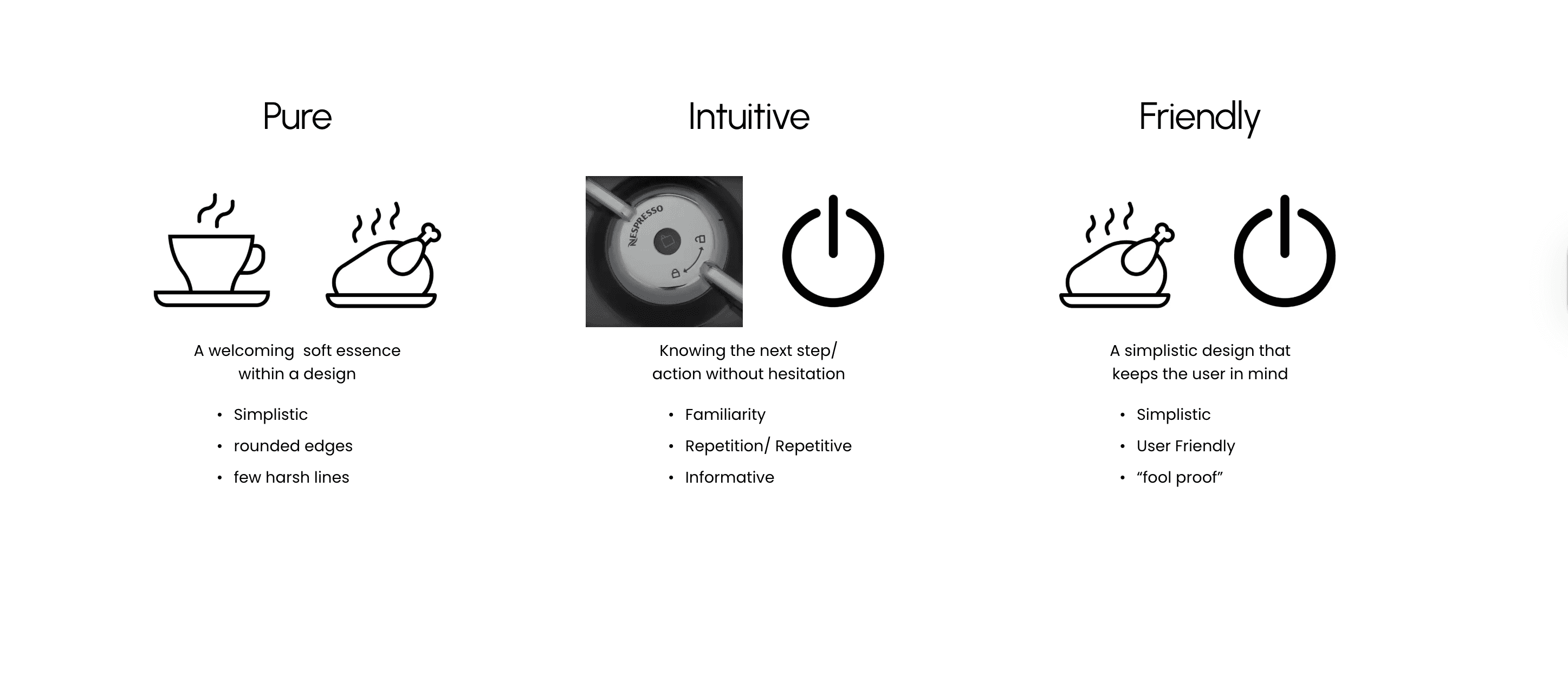
What Do These Principals Look Like When Designing Icons?


Water Filter Icon Re-Design
After defining what these brand principles look like within design, I was given the task of redesigning a water filter Icon for a refrigerator. Based on consumer research, they found consumers consistently had trouble finding where to replace the water filter, and that the graphic did not communicate well.
Problems
Shape & Angles are Confusing
Does not communicate its function well
Original
First Round Ideation

Final Ideation
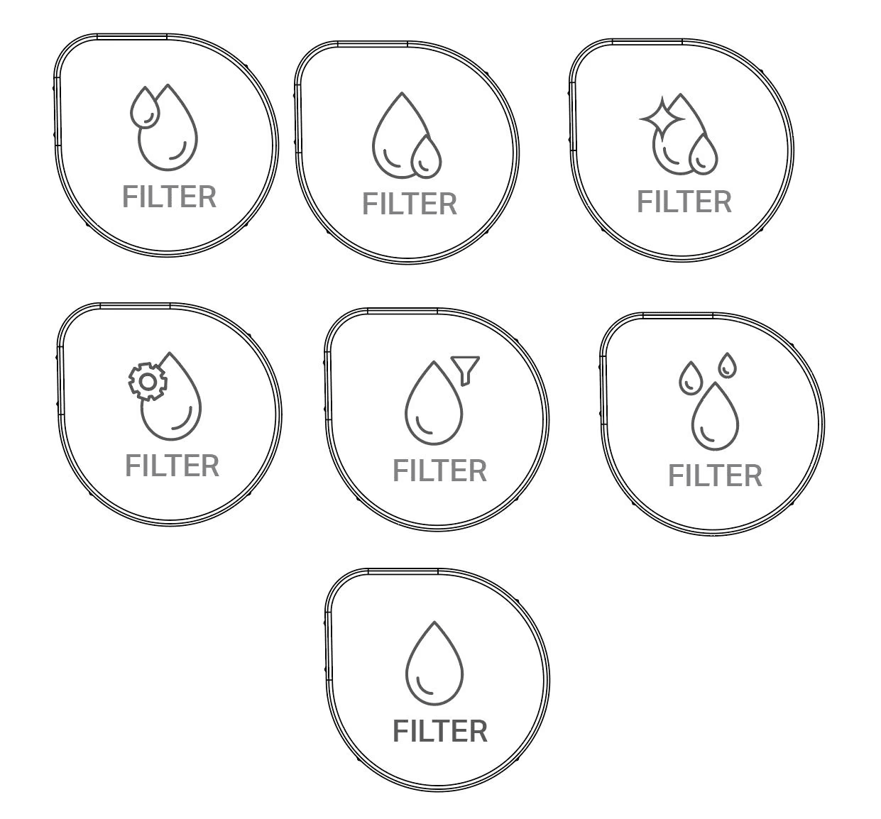

After each round of iterations, I met with the color model finish team that I was a part of to critique each design in the end we were left with this simplistic water filter design that communicates its function with the help of the text.
Project #3
Color of the Year Research
Project guidelines
Find current common trends
Participate in group meetings and discussions
Help forecast future trends and consumer research
I would be happy to discuss this project further. Whirlpool is using my work, making it confidential.